Make Data Presentations Engaging with Mapline’s Story Maps
Industry: Technology
When the draw pad feature was introduced, many have understood the value of mapping in their presentations. Now, presenters can create easy maps to draw radius maps, address
ILLINOIS (PRUnderground) January 21st, 2015
Data alone when presented will not make much of a stir. Why? Human attention is centered in visual presentation. Without the right tools to present data, all efforts will just be wasted. Decision makers are not so much about the data itself. They are after the information embedded on the data – it’s overall effect in the business context. If presenters expect great results from data presentations, they need to inject a good story. What better way to tell data stories is through story maps. These are maps of different styles that allow the viewers to understand the data information in the simplest ways. The stories behind the lines, the dots and the map pins are what connect the presentation to the viewers thus grabbing their attention. Stories help make the message understood easily resulting in positive actions and decisions.
Since last year when Mapline, a web map software, introduced the draw pad feature, a growing number of companies have understood the value of mapping in their presentations. The mapping software allows the presenters to create easy maps to draw radius maps, address locators, and other map styles to be featured in their data presentations.
Draw Pad
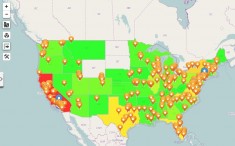
Radius maps are one of the best reasons of using the draw pad features. When data is presented in a spreadsheet, more often than not, the viewers may doze off instead of be interested. Radius maps not only attracts but it also conveniently informs about target market by location. It also reveals fresh ideas for business opportunities. Presenters can plot address locations data (for example: customers’ addresses, competitors’ locations, and target market) to produce a clarified visualization of how the company connects with different factors. They can easily draw a circle (or any shape) around an area to define the radius. This is best used when presenting business planning or in sales meetings.
Aside from the draw pad, here are other mapping tools that can be used for story maps:
Territory Features
 Presenting a map of geographical location data affects the business. When territory overlays are part of the data presentation, it adds up to more sense in the meaning of locations like data analysis to make informed decisions. It also provides mapping solutions like adding territory boundaries to maps, heat map territory colors, and draw custom territories on a map.
Marker Features
Map data presentations with only one colored pins are boring and confusing. Marker features of mapline allow the presenters to customize their pins. They can choose from a wide array of marker styles. They can also upload their own images. When different styles of map pins are used, ideas are ignited. It helps to visualize important factors. On the map, they can also display labels.
Data presentations need not to be a data dump. Storytelling with Mapline’s story maps are easier to understand, more attractive and drive positive results. Interested in creating story maps? Visit Mapline today.
About Mapline
Mapline develops tools to transform analysis into a visual experience. It’s mapping technology is one of the most powerful ways to visualize data from Excel spreadsheets to optimize logistics, enhance market planning, identify growth opportunities, or mitigate market risks. Mapline leads in data simplification and presentation and is committed to delivering the tools businesses need to outpace competition.


